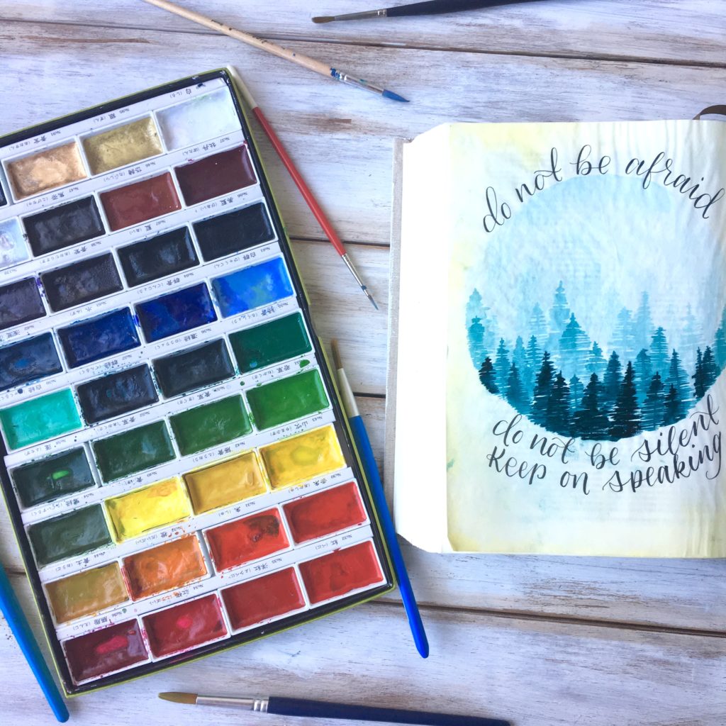
I love using watercolor in my Journaling Bible. I love it because I feel like even if I mess up, or the colors bleed or pool in certain spots, it still looks very pretty. It’s forgiving because you can add more color, or more water easily, or use a paper towel to blot up mistakes. And I personally just love the light and airy look of watercolors.
But before I started bible journaling I had really only used watercolors once in an elementary school class! So it was intimidating to first put that wet paintbrush to my precious Bible. But eventually I went for it; and after some practice, I now can’t imagine having not taken that first step. And I know the same can happen for you too!
I by no means am a professional artist, but I think I may still be able to give you a few helpful tips for if you too are wanting to use watercolor in your bible but aren’t quite sure where to start!
*note* You really do not need any fancy supplies to get started. Any set of watercolors (though I do find panned watercolor to be a bit easier for beginners) and some basic round brushes will do. I use this Kuretake Gansai Tambi Watercolor set (affiliate link); it is a great mid-tier set that is great quality and affordable!
If you are a visual learner, here is a video to mirror this blog post that goes through each of these tips (as well as a few other pointers) and shows you how to create a pretty and simple forest!
Don’t Be Afraid of Water
First off, you don’t need to be scared to use a lot of water. Bible pages are thin, and water does make them more fragile, but as long as you are careful handling your page, it won’t tear. Also, no matter how much water you add, your page will crinkle up a bit. However, after a few days sitting closed in your bible, your page will flatten out and it won’t be too noticeable.
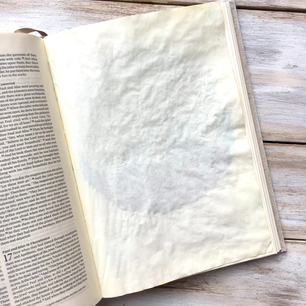
If you feel nervous about your page tearing or your color bleeding through the page, go ahead and prepare your page with a layer of gesso! (see here if you don’t know how to prep your page.) I will say though, that 97% of the time I do not prepare my page when using watercolor. I have never torn a page or had my watercolor paint bleed through (though I do get some faint ghosting, as you can see in the image below of the backside of my finished page.)
Layers Layers Layers
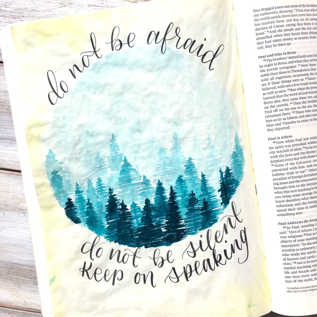
My second tip is to use layers! If you have not used many paint mediums before, this can be a hard thing to remember. One of the beauties of watercolor is watching the paint bleed into the wet spots. However, to create dimension and definition, you’ll want to let sections dry and then go over them in layers. This is particularly important with landscapes and more detailed works but can make even simple backgrounds really stand out.
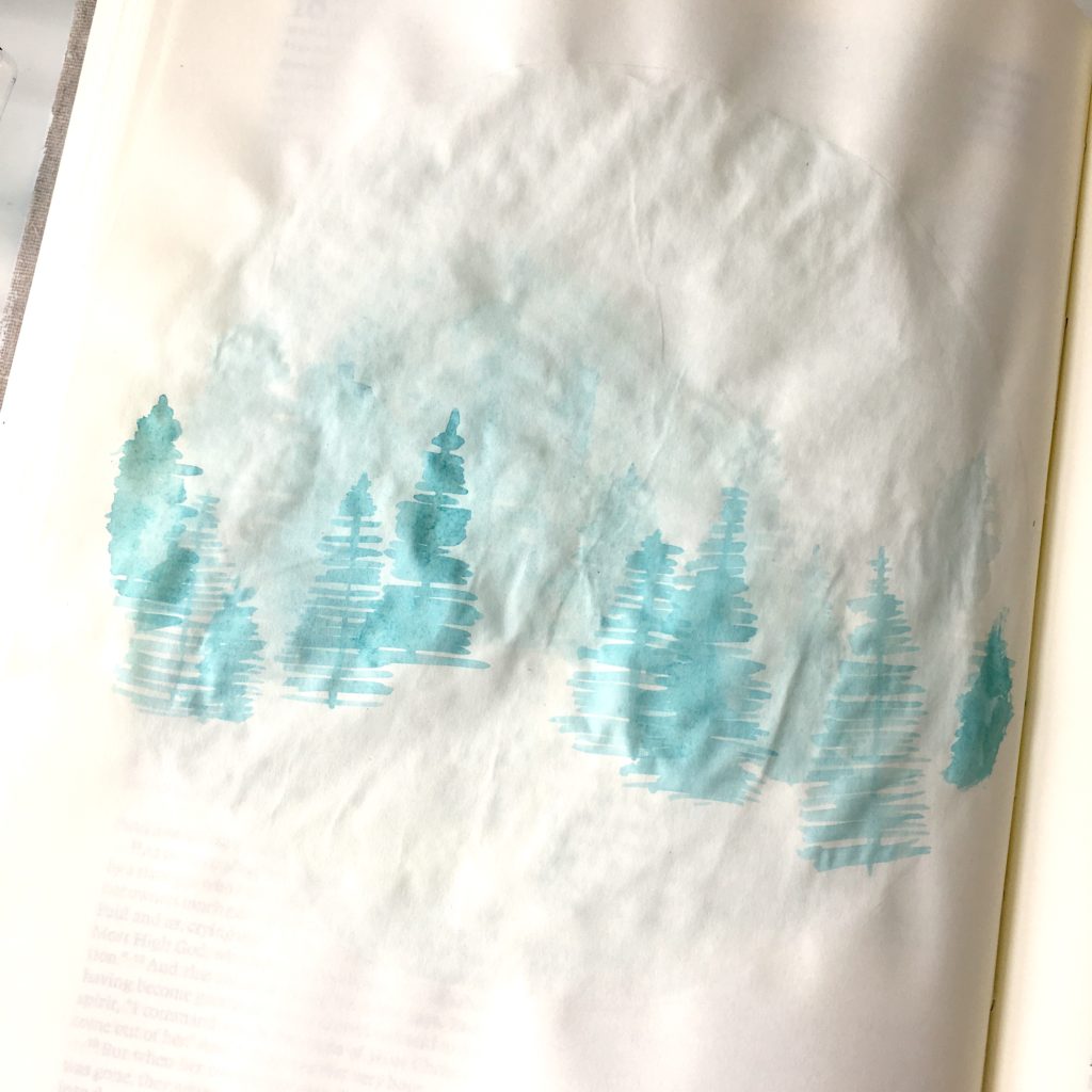
For example, when making the simple forest, I started off with the very light background and went right in while it was wet to add a couple fuzzy and very light background trees. Then, I let that layer dry and grabbed just a tiny bit more color to add some more defined trees. With each new layer I do, I am also going to move down on my page and grab more paint to create that forest that seems to go on into the distance.
This is going to create much more interest than if I were to keep putting trees over trees before each layer is dry, and therefore, letting them all bleed together.
Play With Saturation
My third tip for you is to play with the saturation of your paint. Watercolor is so cool because you can create so many variations of just one color by the amount of water you add!
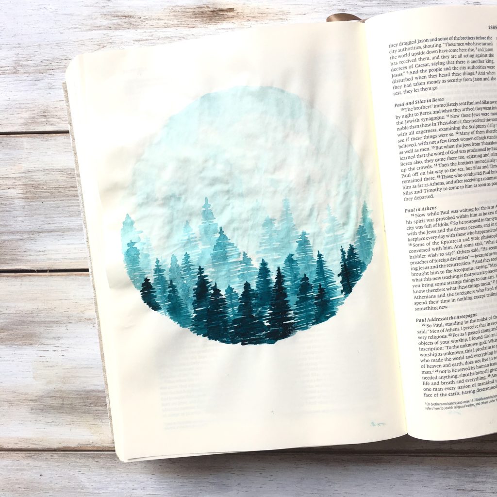
To make the forest, I used just one color! (I chose a blue/green but you could use any color you want) I mix up a ton of water with just a tiny bit of paint. Then, with each layer that I add, I mix in a little more paint to give me a darker color. By the bottom of my painting, the last few trees have just enough water to get the paint to transfer to my brush and paper, so it is almost straight paint.
Playing around with saturation like this can add a lot of depth into your piece, and you can use this technique in all kinds of ways! Like when making florals, you can make some petals or areas of your flower more saturated than others. Or some very light leaves using a lot of water, and some dark leaves with very little water. This variation really makes watercolor florals POP.
Another example for a very easy background would be to start at the top or bottom of your page, with a very small amount of pigment, and as you work your way across the page, add in more paint! You’ll have such a pretty ombre background!
Practice
If this all still sounds so intimidating, I urge you to just go for it. As with any craft, watercolor takes practice. But don’t be afraid to try. And don’t be afraid to mess up a page in your Journaling Bible! Remember, the point of Bible journaling is to spend time in Gods word and glorify him through your art. So no matter what, your page is going to be beautiful in his eyes!
It’s always scary to try new things, but don’t hold yourself back. The only way to improve the skill is to keep doing it!
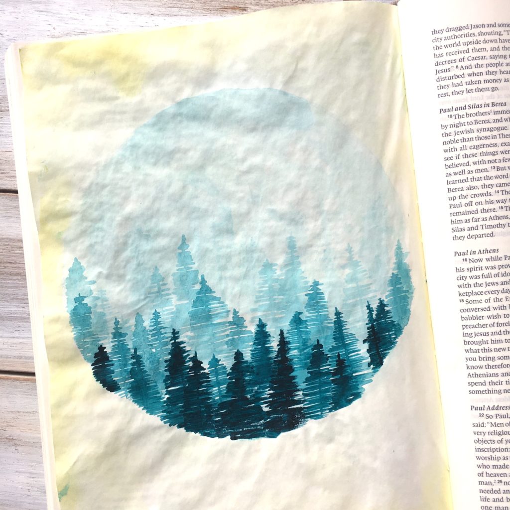
Some Extra Things to Remember
– Put a piece of paper below the page you are working on to protect the bible pages below
– Always start with your lightest colors first, then add in progressively darker colors
– Watercolor usually dries lighter in color than when it was wet
– Watercolor acts very differently on bible pages than it does on watercolor paper because the bible pages are so smooth. This just takes time and practice to learn. Eventually, you will be able to have a clear idea of how your paint is going to act. Have fun with it!
Be sure to watch the video at the top of this post (or HERE if you don’t feel like scrolling back up.) I know it can be helpful to see it actually being done. xoxo
