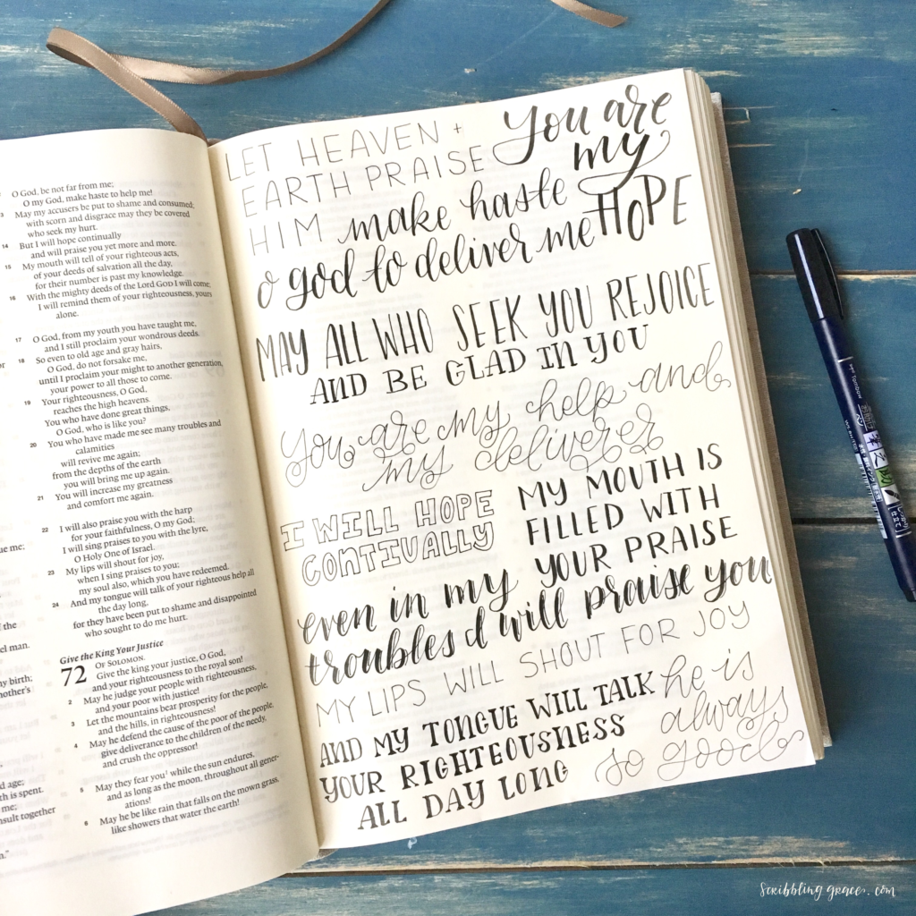
I quickly found that the hardest thing for me was coming up with different lettering styles to use. I could use my basic handwriting and faux-calligraphy, and I knew the idea behind creating other styles, but then my mind would always draw a blank coming up with different ways to write things! Hopefully, I am not alone in this struggle and you can understand what I mean!
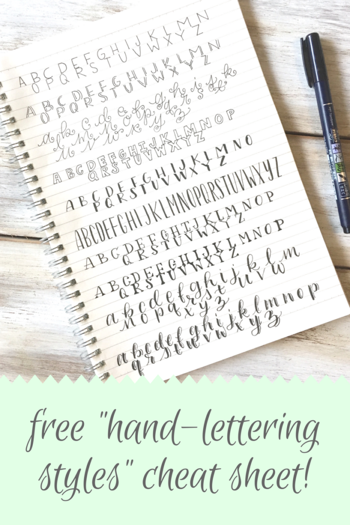
So after constantly going back and forth to Pinterest and Instagram to see what styles other people were using, I figured out 10 styles, that I could easily do, and made a cheat sheet to carry with me! I went ahead and digitized my cheat sheet which you can download for free here or by clicking the image below!
These styles are all fairly straightforward, and if you know how to do faux-calligraphy (again, see here if you don’t) you can do any of these! Some are basic, like the monoline, and some you’ll need to thicken the downstrokes, like the script, san serif, or serif.
Monoline
This one is, of course, the easiest; use simple and clean lines to write out your word in all caps. Try to keep all your letters the same height and width.

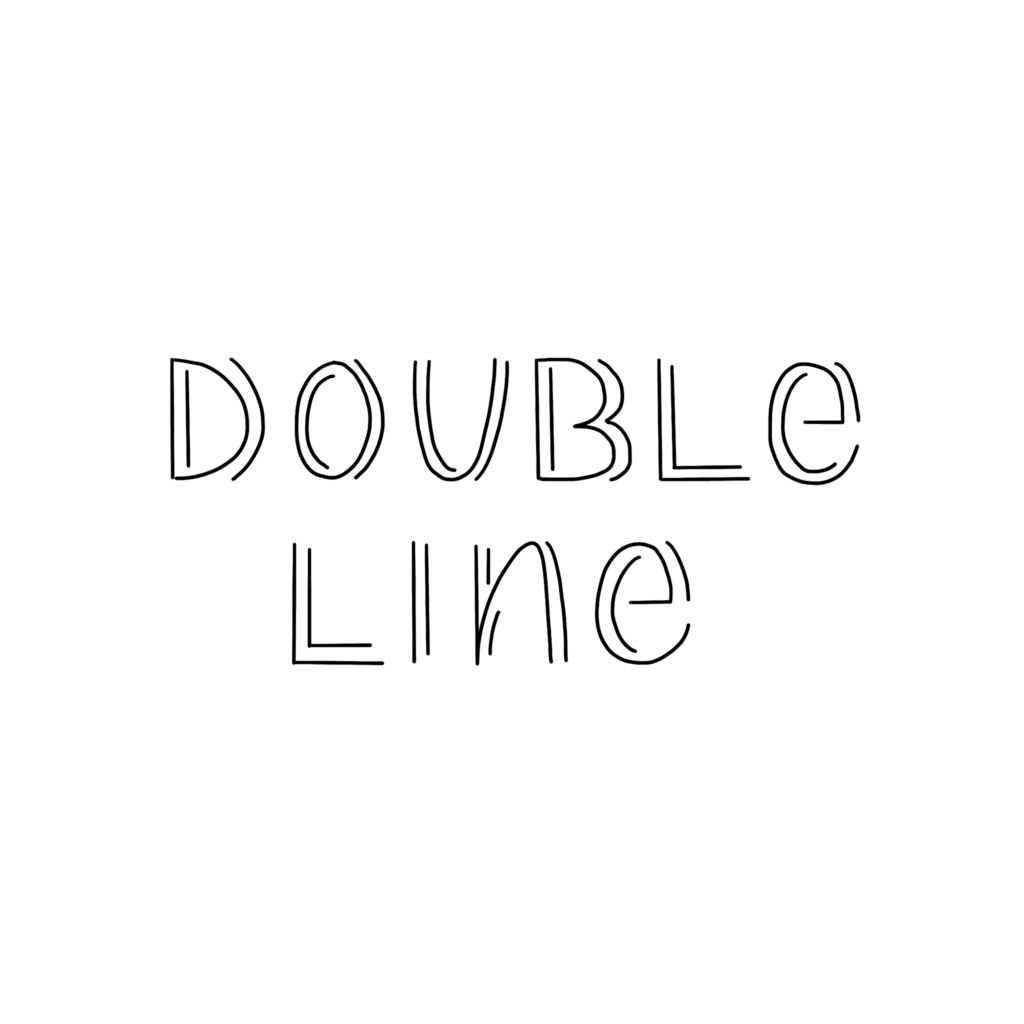
Double Line
For this, just build on the “monoline” and add lines on both the inside and outside of the letter!
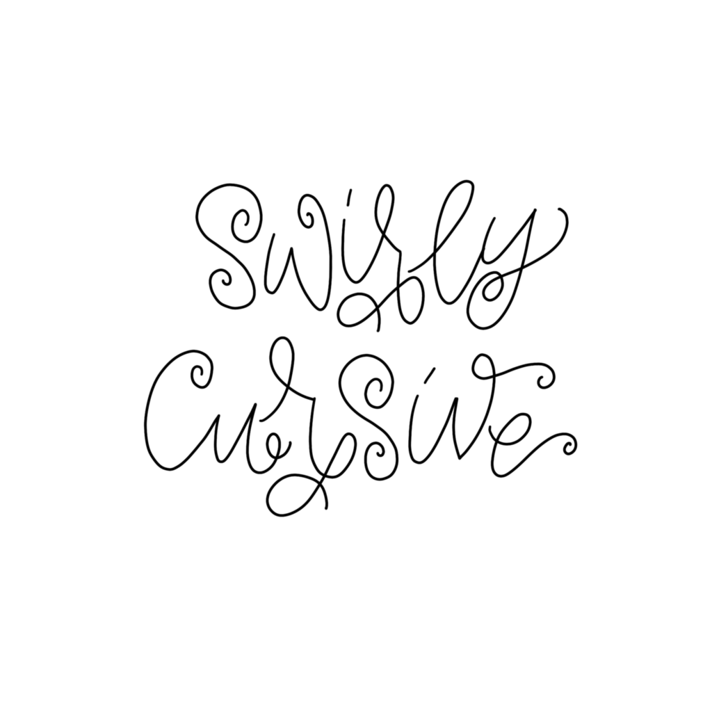
Swirly Cursive
If you aren’t quite ready to get into faux calligraphy, just use a simple cursive and add some swirls on the ends!
Block Letters
I mean, can’t go wrong with good ol’ block letters! 😉

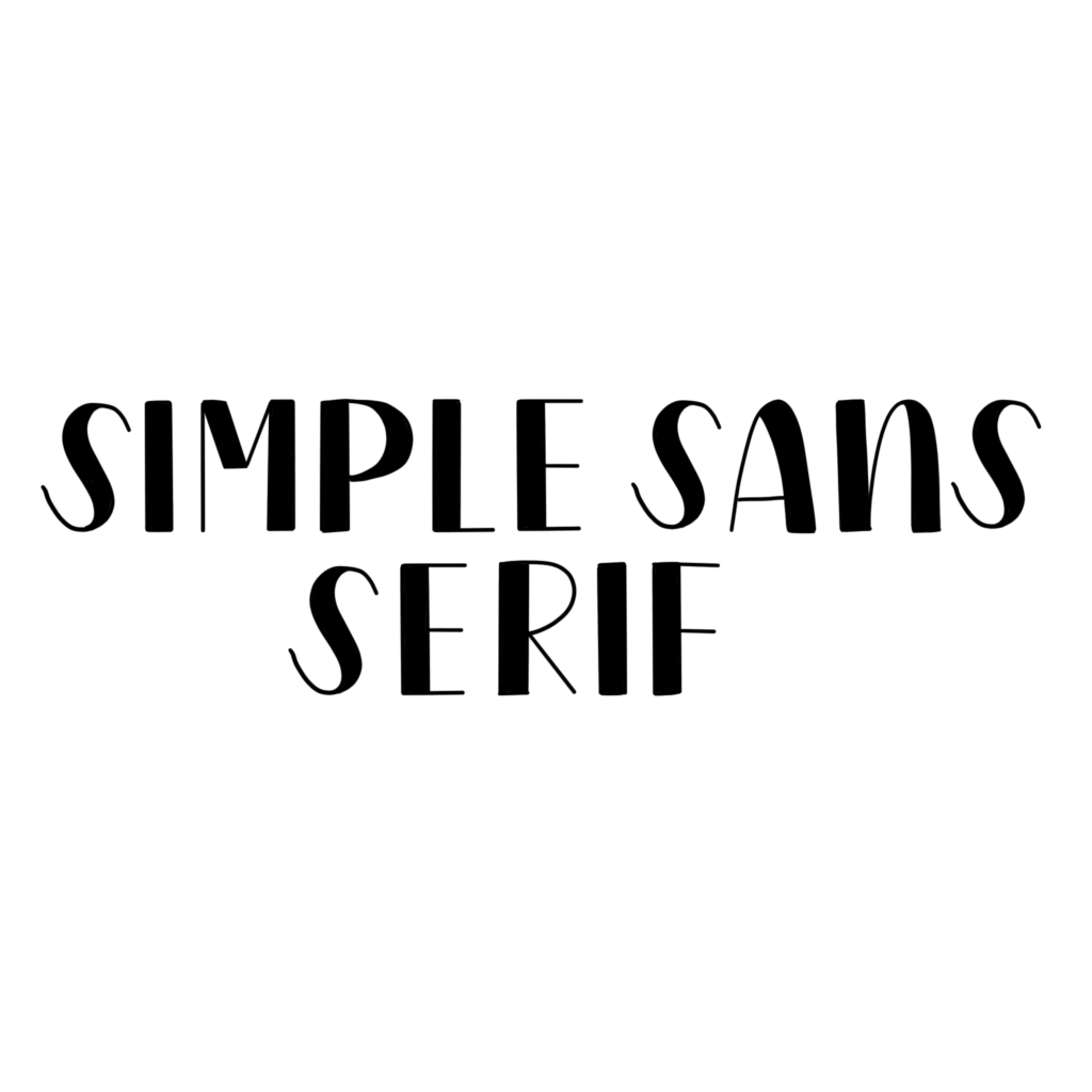
Simple Sans Serif
A “serif” defined by the Merriam-webster dictionary is “any of the short lines stemming from and at an angle to the upper and lower ends of the strokes of a letter”. So sans-serif means there are none of those lines stemming off the letters. Technically the two styles above are also sans-serif, but if you thicken the downstroke (just as in faux calligraphy but with uppercase letters instead of script) on the letters you get a whole new lettering style! This is my favorite style for quick but pretty sermon notes!
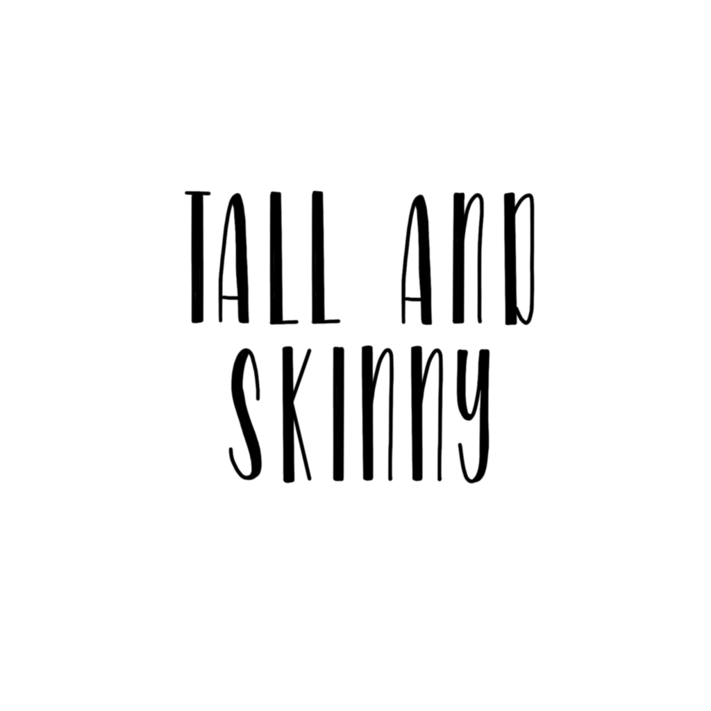
Tall and Skinny
Using that san serif from above, you can create so many different variations! You can make them tall and skinny, as in this example, or short and fat; you can make the downstroke super thick, or not thick at all. So play around with it!
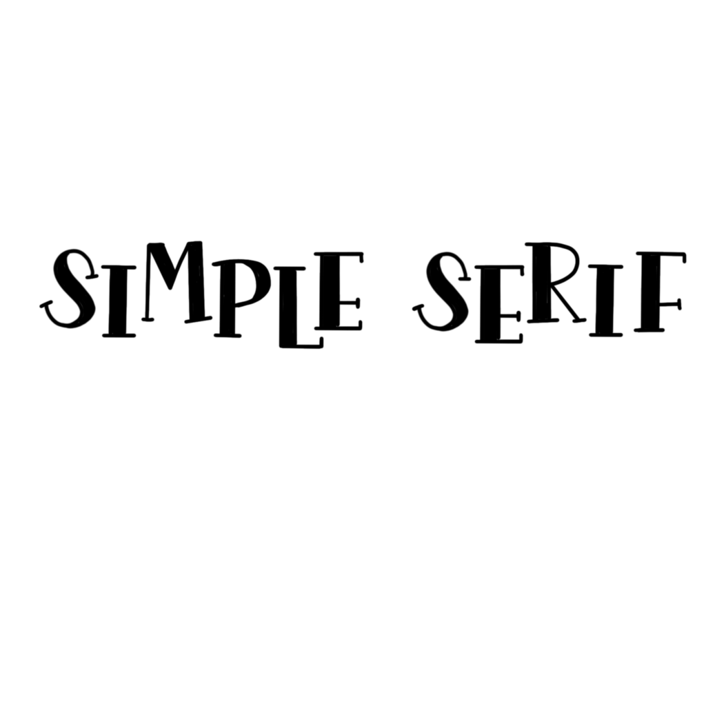
Simple Serif
Here we are getting a little fancier and making a serif. So I started off with my same sans-serif style and just added really simple little lines to the ends of the letter! (I also decided to play around with the placement of the letters here; which is another great way to vary your lettering styles!)
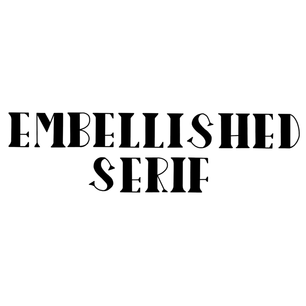
Embellished Serif
To take the serif one step further, just connect the little lines of the simple serif to create little triangles!
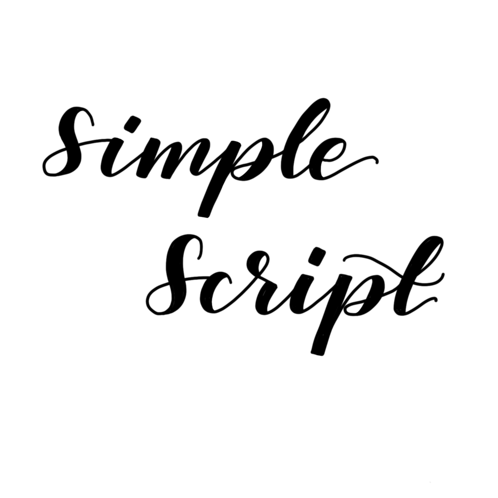
Simple Script
This style is your basic calligraphy or faux calligraphy that I mentioned above!
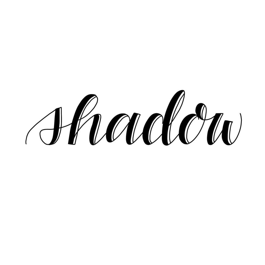
Shadow
For this variation of the simple script, just add a second line onto one side of your downstrokes! You can either connect this second line at the top and bottom or leave it open to create a different effect!
There truly are endless lettering styles, but these few styles are some great basics, and the styles I always use. Be sure to download your free cheat sheet! Let me know if you have questions in the comments below!
